引き続きUdemyでPython for Time Series Data Analysisで、特にDataの可視化方法を学習する。便利で高機能なライブラリが利用でき、pandasからすぐにplotが可能。
Dataの整形
import pandas as pd
pop = pd.read_csv('./UDEMY_TSA_FINAL/Data/population_by_county.csv')
pop.head()
pop.columns
pop['State'].unique()
pop['State'].unique()
pop['County'].value_counts().head()
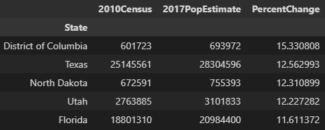
pop.sort_values('2010Census',ascending=False).head()
pop.groupby('State').sum().sort_values('2010Census',ascending=False).head()
sum(pop['2010Census']>1000000)
def check_county(name):
return "County" not in name
myser = pop['County'].apply(lambda name: "County" not in name)
myser.value_counts()
pop['PercentChange'] = 100*(pop['2017PopEstimate'] - pop['2010Census'])/(pop['2010Census'])
pop.head()
states = pop.groupby('State').sum()
states['PercentChange'] = 100*(states['2017PopEstimate'] - states['2010Census'])/states['2010Census']
states.sort_values('PercentChange',ascending=False).head()
ヒストグラムのプロット例
import pandas as pd
df1 = pd.read_csv('./UDEMY_TSA_FINAL/03-Pandas-Visualization/df1.csv',index_col=0)
df1.head()
df2 = pd.read_csv('./UDEMY_TSA_FINAL/03-Pandas-Visualization/df2.csv')
df2
df1['A'].plot.hist()
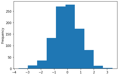
df1['A'].plot.hist(bins=80,edgecolor='k').autoscale(enable=True,axis='both',tight=True)

f1['A'].plot.hist(grid=True)

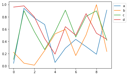
ラインプロットの例
df2.plot.line(y=['a','b','c'],figsize=(10,4),lw=4)

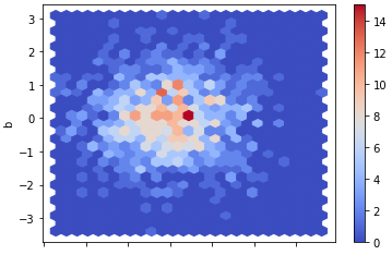
散布図の例
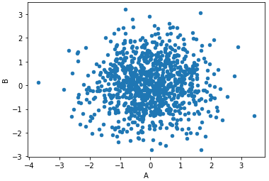
df1.plot.scatter(x='A',y='B')
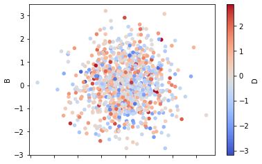
df1.plot.scatter(x='A',y='B',c='D',cmap='coolwarm')
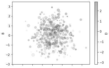
df1.plot.scatter(x=’A’,y=’B’,c=’D’,s=df1[‘C’]*50,alpha=0.3)
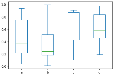
ボックスプロットの例
df2.plot.box()
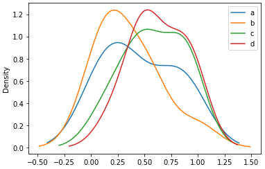
密度分布プロットの例
df2.plot.kde()
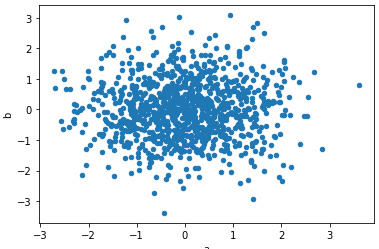
import numpy as np
df = pd.DataFrame(np.random.randn(1000,2),columns=['a','b'])
df.plot.scatter(x='a',y='b')
様々なプロットの設定変更
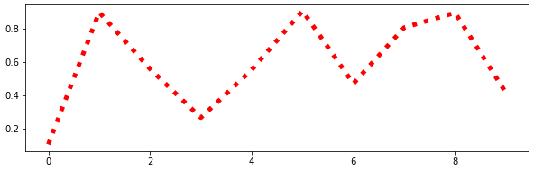
df2['c'].plot.line(figsize=(10,3),ls=':',c='red',lw=5)
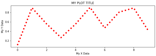
title = "MY PLOT TITLE"
xlabel = 'My X Data'
ylabel = 'My Y Data'
ax = df2['c'].plot.line(figsize=(10,3),ls=':',c='red',lw=5,title=title)
ax.set(xlabel=xlabel,ylabel=ylabel)
ax = df2.plot()
ax.legend(loc=0,bbox_to_anchor=(1.0,1.0))
import pandas as pd
df3 = pd.read_csv('./UDEMY_TSA_FINAL/03-Pandas-Visualization/df3.csv')
print(len(df3))
print(df3.head())
df3.plot.scatter(x='produced',y='defective',c='red',figsize=(12,3),s=3)

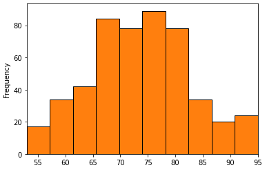
df3['produced'].plot.hist()
df3['produced'].plot.hist(edgecolor='k').autoscale(axis='x',tight=True)
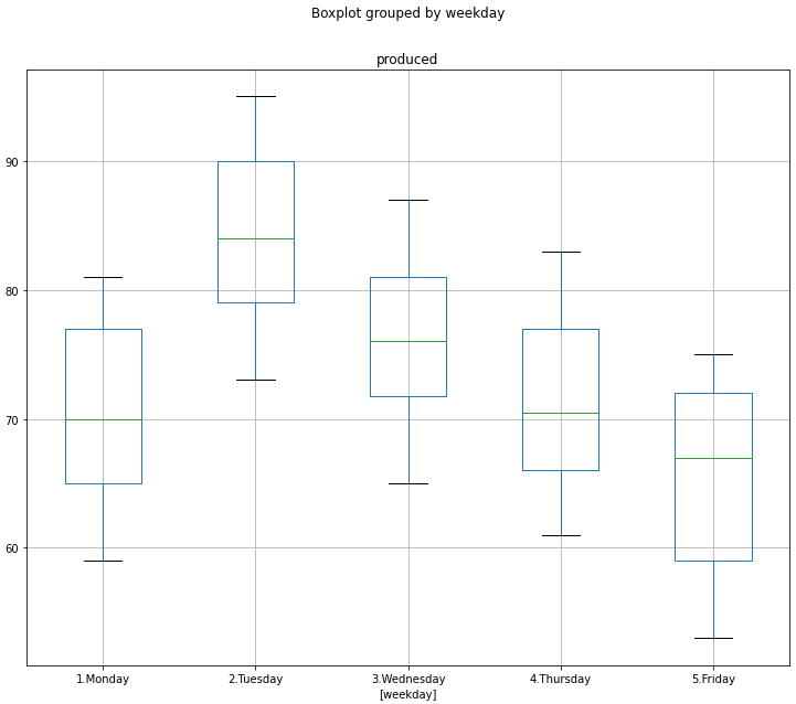
df3[['weekday','produced']].boxplot(by='weekday',figsize=(12,10))
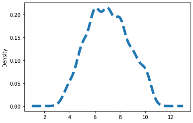
df3['defective'].plot.kde(ls='--',lw=5)
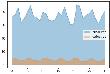
df3.loc[0:30].plot.area(stacked=False,alpha=0.4)
ax.legend(loc=0,bbox_to_anchor=(1.3,0.5))